

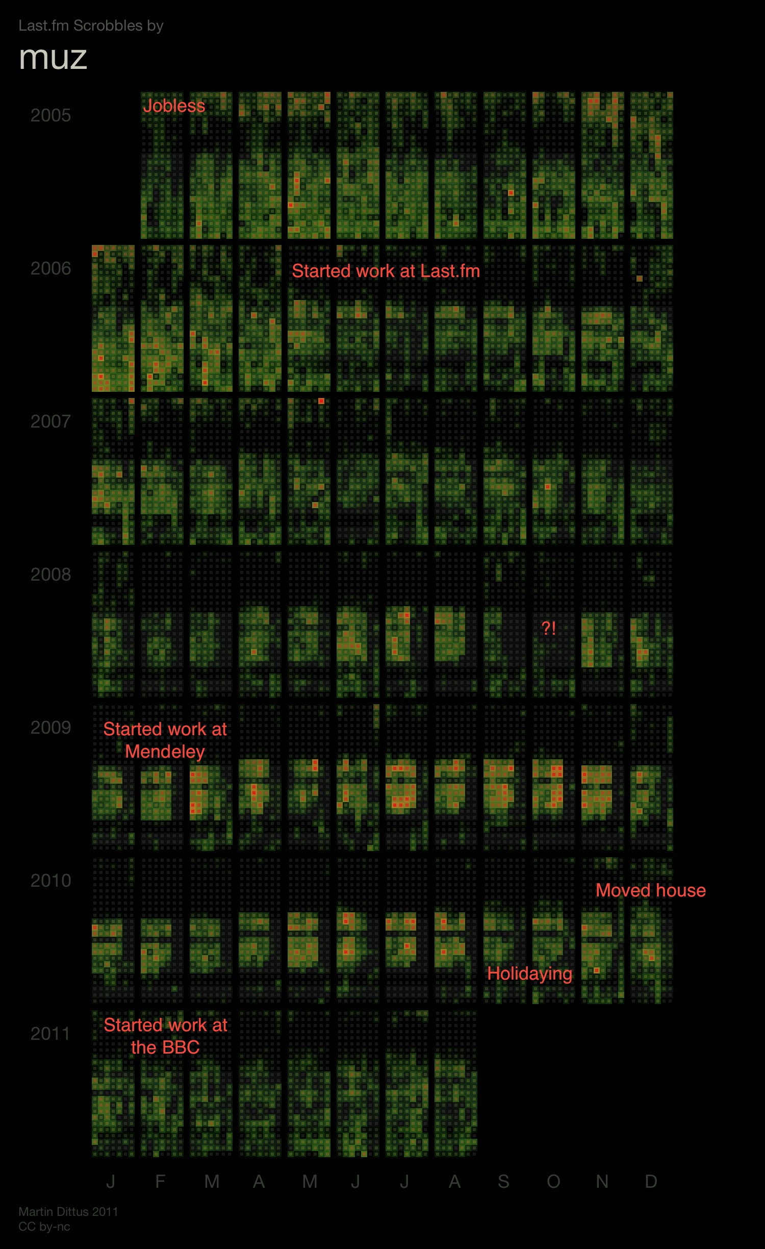
Previous · Next
Daniel1986 has been scrobbling since early 2007. He writes:
2007:
Jan-Mar: Dissertation time at University. Nearly all my time spent at a desk working. Scrobbler keeping track of all my excessive Blur iTunes plays without me realising. By end of March I realised Last.fm was more than just online radio- maybe they're hiring?
Apr-Jun: All uni work finished. Spend all my time outdoors, not much music listened to at all.
July-Sept: Apply for job at Last.fm. They ask what my username is. Shit! Start scrobbling more!
Oct-Dec: After a few weeks at working at Last.fm, I finally buy a pair of headphones like everyone else. Daytime scrobbling increases.2008:
April: First month where I start working late more regularly. Moved house too.2008-2011: Summer months tend to mean longer listening through the day.


