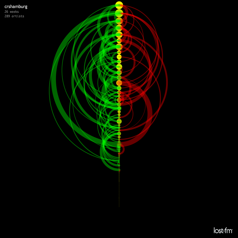
crshamburg
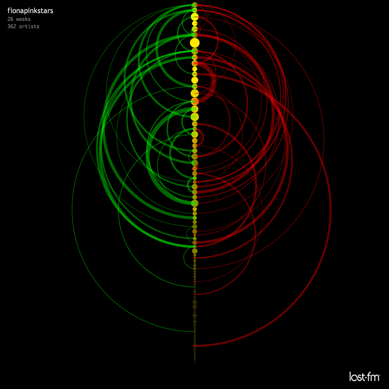
fionapinkstars
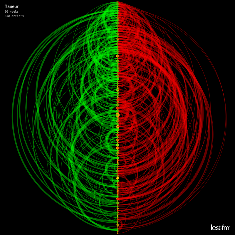
flaneur
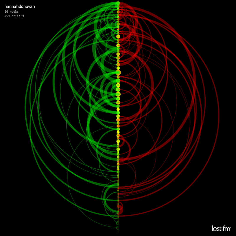
hannahdonovan

hoff
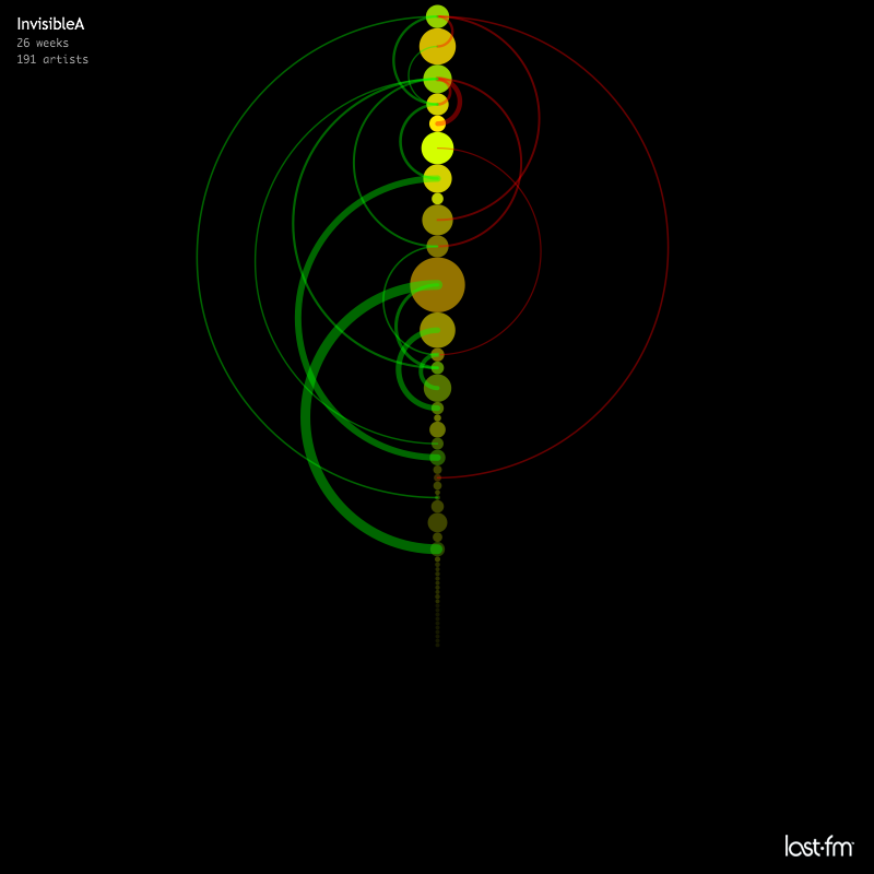
InvisibleA
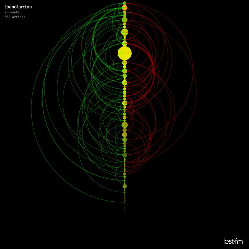
joanofarctan
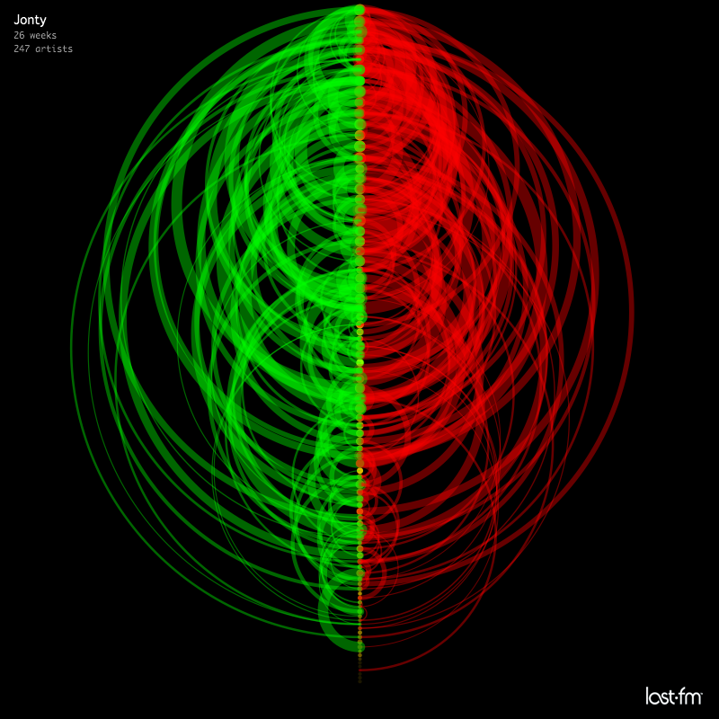
Jonty

julians
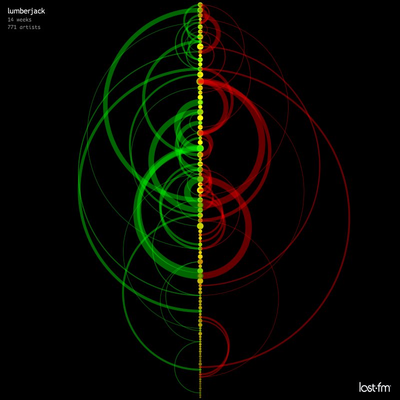
lumberjack
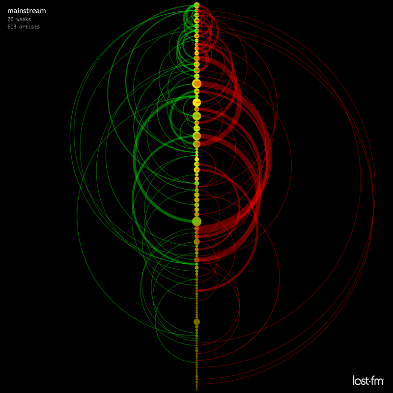
mainstream

martind
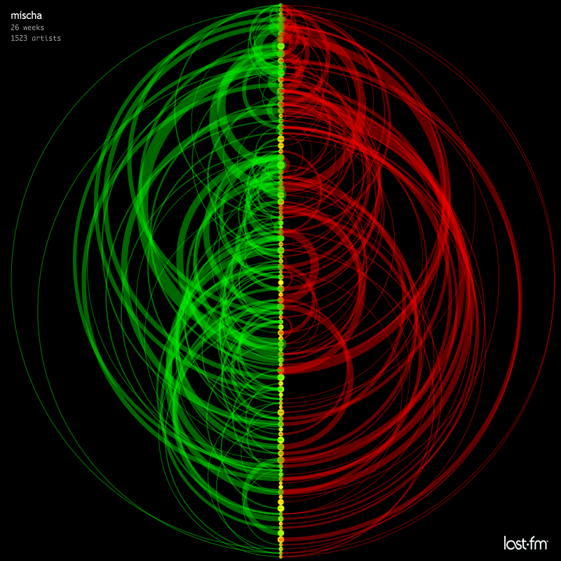
mischa
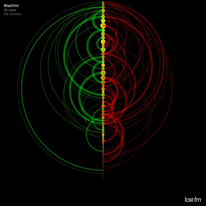
MissHimi

mokele
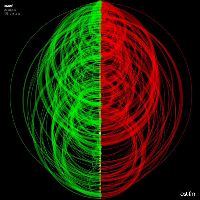
muesli
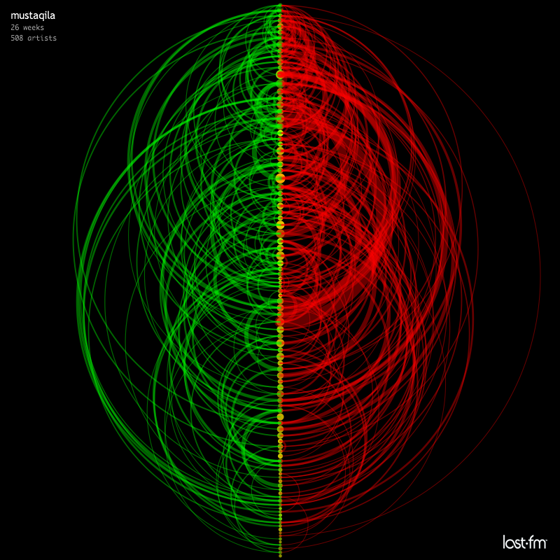
mustaqila

nova77LF

pete_bug
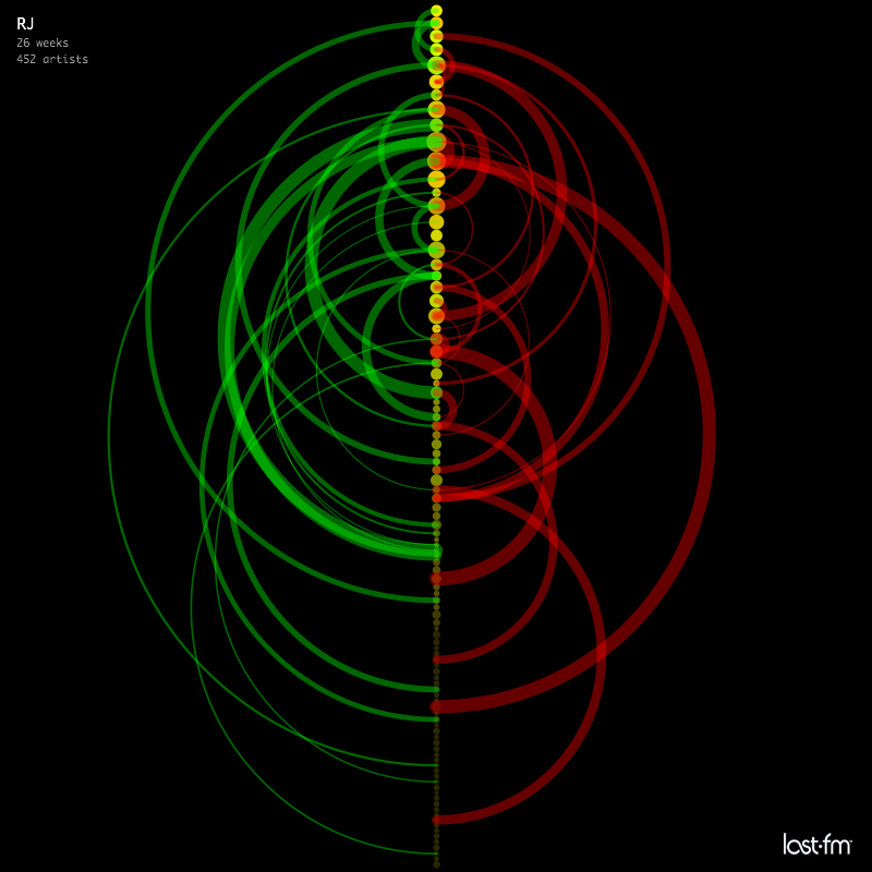
RJ

RNR
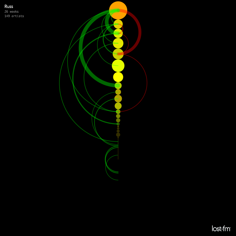
Russ
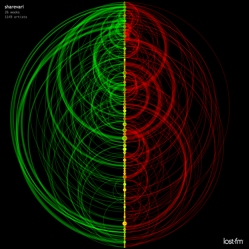
sharevari

sideb0ard
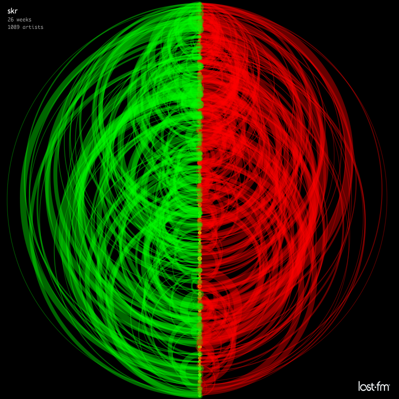
skr
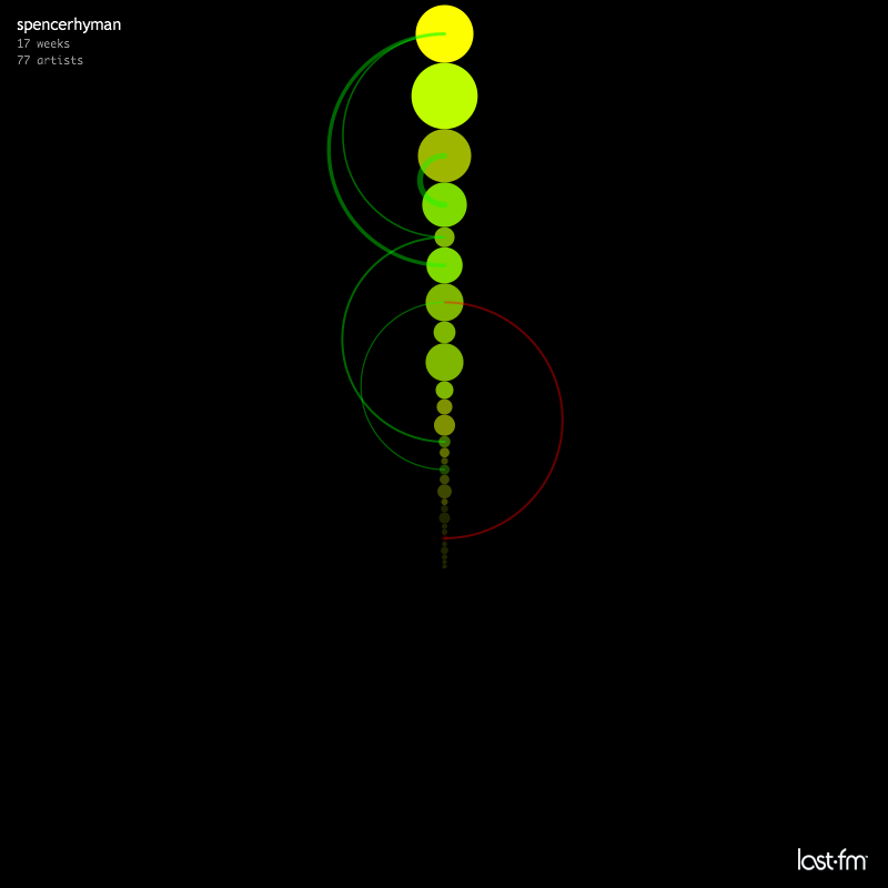
spencerhyman
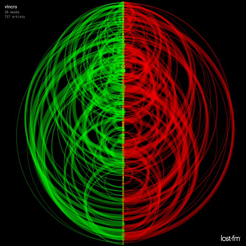
vincro
A simple visualization of music listening behavior over time: How frequently do you change your listening habits? How mainstream is your taste?
Point size corresponds to the combined reach of artists that inhabited this chart position.
Point color signifies chart entry- and exit-points: The green color component of a point corresponds to the number of times this chart position was an entry point for a rising artist, and the red color component the number of times this chart position was an exit point for a falling artist.
Arcs are directional and drawn clockwise: In the left half of a graph they point from bottom to top, in the right half from top to bottom.
Arc strength corresponds to the combined reach of artists that moved from the source to the target position.
martind 2006-10-08.
The graphs were created with Processing.
The visualization concept is based on visualizations by Martin Wattenberg.